The Trend of Colours
- PRIYANG PRIYADARSHI
- Oct 18, 2021
- 2 min read

Colour wheel from objects.
The team were a healthy interesting bunch of people from the Motorwalas, Apparel designs. Each had an amazing view point towards the way we should approach the colour spectrum available to us.
Namely,
Mayank from TAD,
Gauri AD,
Yash AD,
Nayanthara AD,
Ankit AD,
Priyang from TAD (myself)
We had our thoughts rolling from clothes, magazines all the way to flowers and natural parallels to even garbage. Which lead us to an area where we use colourful product that are somewhere the reason we bought /still buy them. The packaging and colours are too very responsible factors for why we also end up buying them. Looking back, I see that I looked forward to a stereotypical mindset set by the marketing trends in India.
The aim with this colour wheel was to understand the variety of products that exists in a particular packaging of that particular colour. And why they sell the way they sell. The importance of colour in real world of perception.


The contributions of all the team members were incredibly helpful to figure out what to choose, and perfect the direction to proceed. Getting picture was a tedious task, not everyone (like myself) were able to capture the same amount of images.
But the course of work was further divided to compile the work, where it was again balanced with continuous guidance from all, while everyone pushes to compile to work and then I was fortunate to finalize the finished furnished assignment into the Colour Wheel.
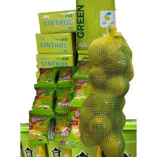
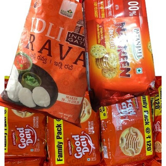
Packaging of daily products to understand Colours of daily life.
To note,
· The colour of the packaging in kitchen and toiletries product have some colour based relation with what's inside. Such as lemon flavoured candy or soap.
· Orange in food items being a positive vibe of being pure and of the utmost quality.
· Luxury items, such as chocolates associate themselves with a vivid purple hue that reflects to owners pride to hold the product.
· Blue associate itself with more non-edibles, and are meant to be a clean / cleaning substance, proving it will be as white as blue. (just the role of Ujala neel on any white clothe).
The final colour wheel was also not the spectrum of colours but also the spectrum of different values, virtues and uses these products are spread across our daily life.

It was a very fun project, lots of explorations, lots better understanding of feelings before buying the product, that might have the same ingredients, and somewhere colours will be the factor we might buy the product for. The team is also very enthusiastic and motivated to out-work the project but showing different means /uses of colours practiced through different medium, such as books & magazines, stones & minerals, floral elements of nature, vegetables - fruits and couple more.


Comments